Ripple
Case Study
A Strategic Shopping Experience
Ripple helps environmentally conscious people make fast, value-based decisions about their daily purchases.
When a customer goes shopping, they have a certain set of values they are looking for in a product. For example Crop rotation, Non-GMO, Fairtrade, organic. The brands they buy also have a certain set of values in the way they source materials or in the way they treat their laborers. We wanted to bridge the gap between the user and the brands that they buy.
Team Members: Atria Azrami, Kevin Simmons, Marianne Willman, Sana Desai
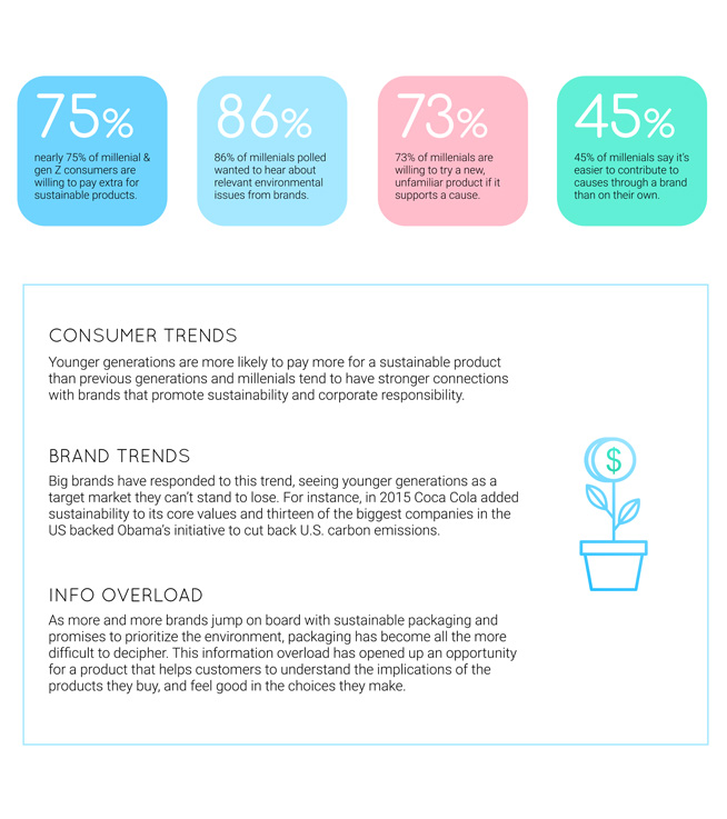
User Persona and Trends Research- Key Findings
1. Create a conversation around consumer choices
2. Increased participation in environmentally friendly efforts
3. Increased critical engagement with brand stories
4. Providing a place to find succinct, non-biased information about brands
5. Realign eco efforts to become synonymous with peoples’ daily routines


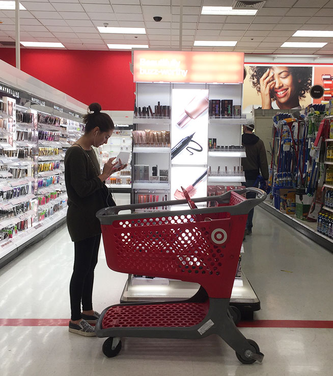
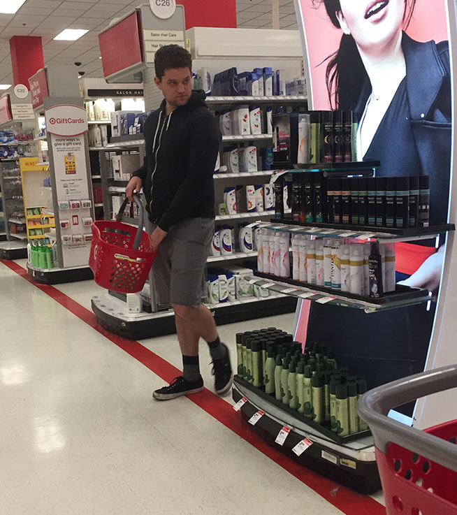
Conducted human behavioral and posture studies ( while shopping ) to determine the point of product interaction


Figuring out the key features that our product needs

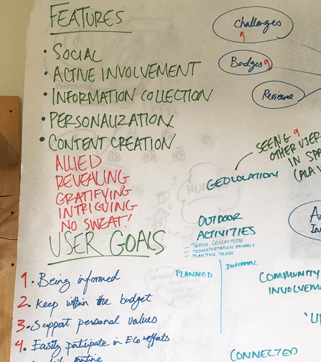

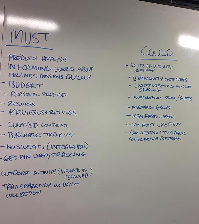
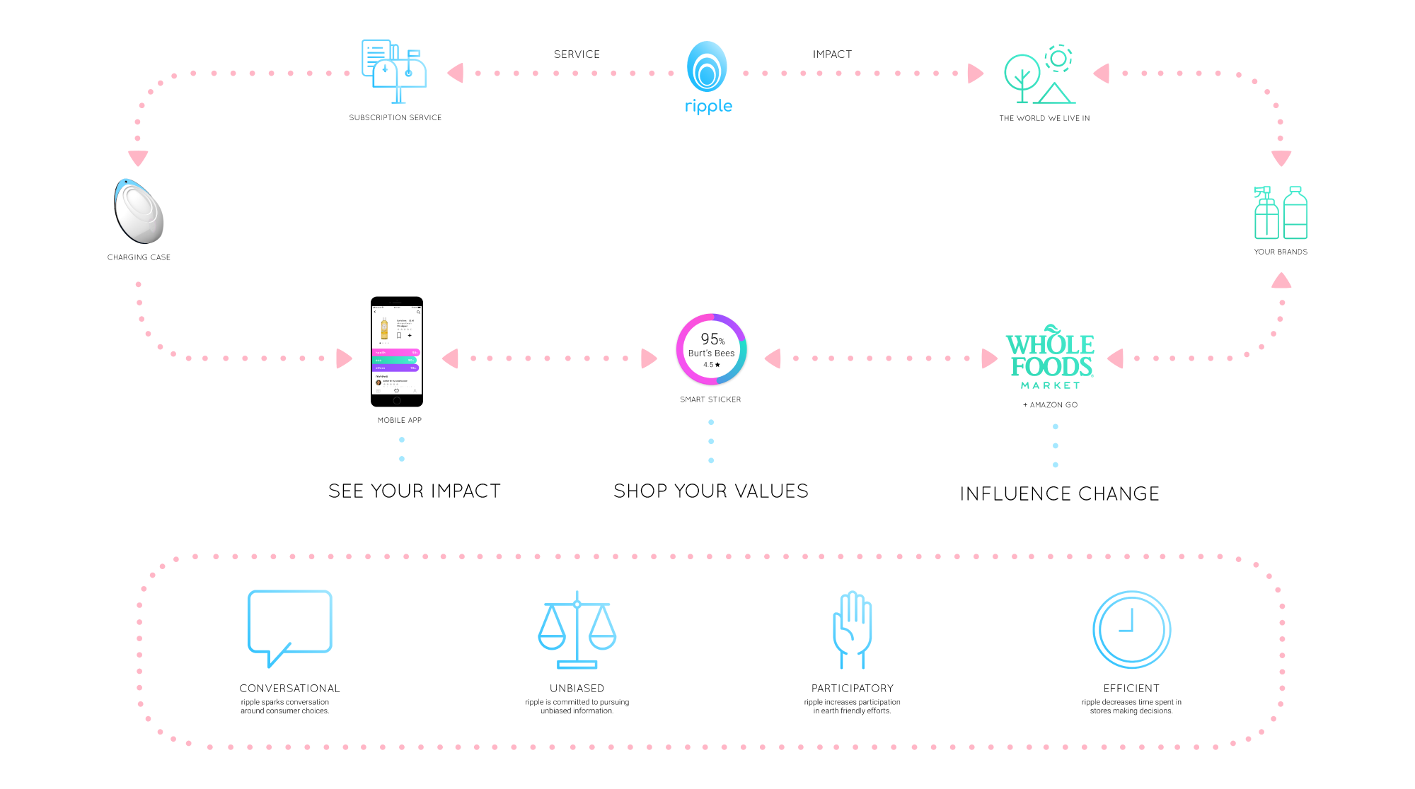
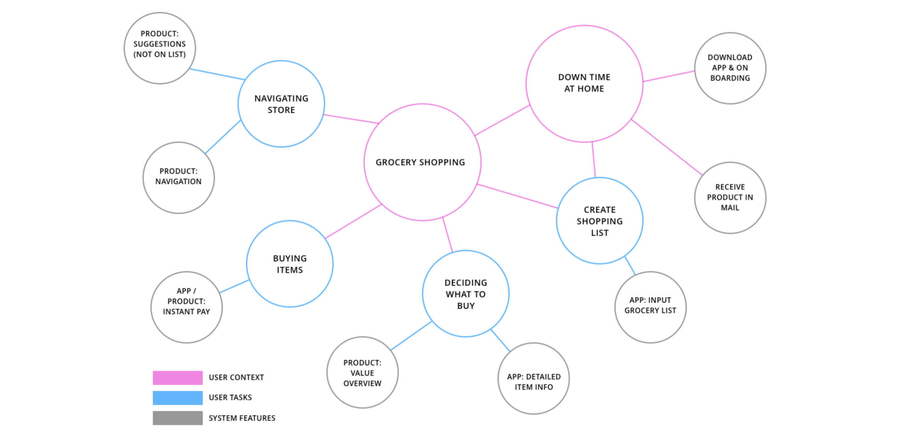
Ripple Ecosystem

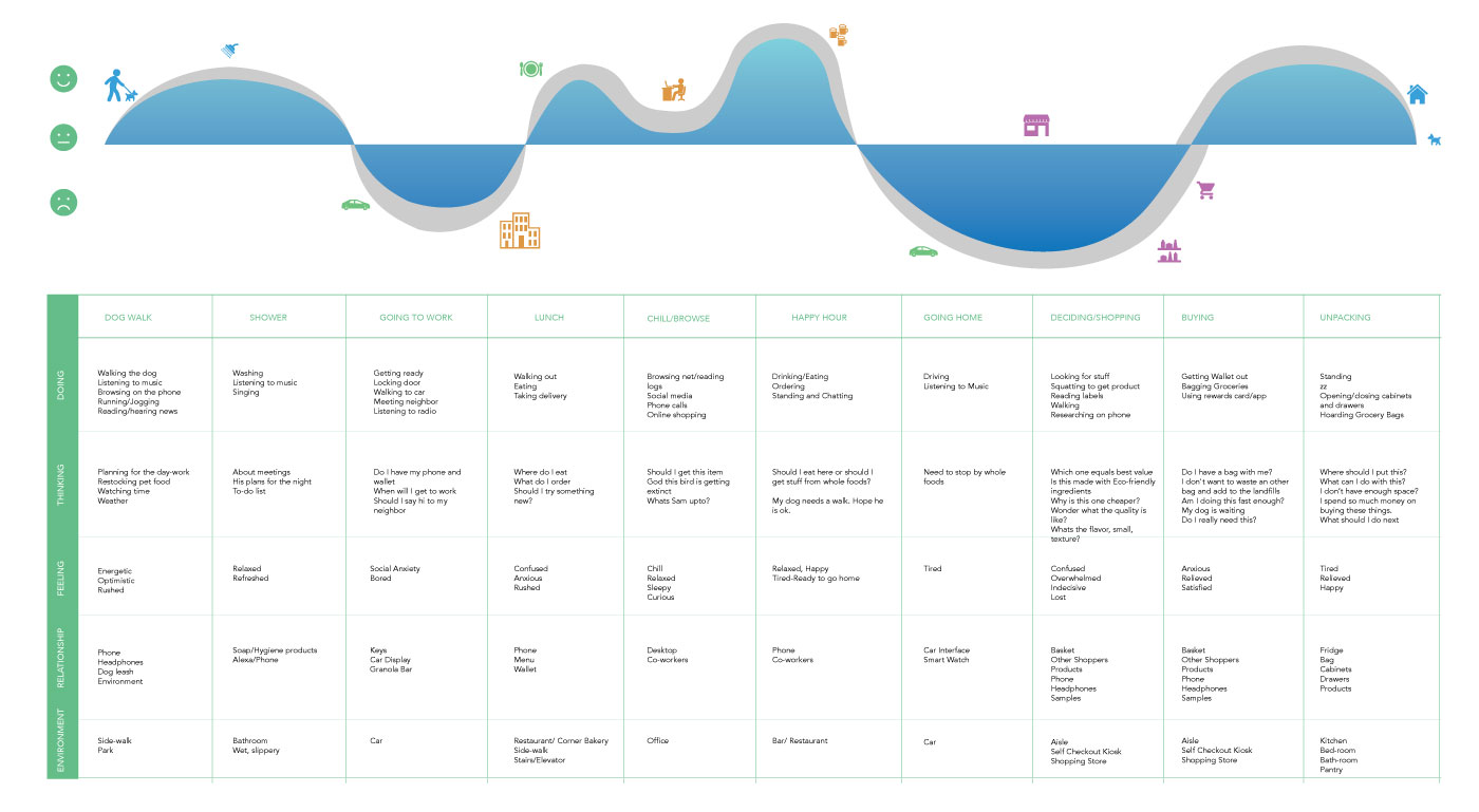
User Journey Map
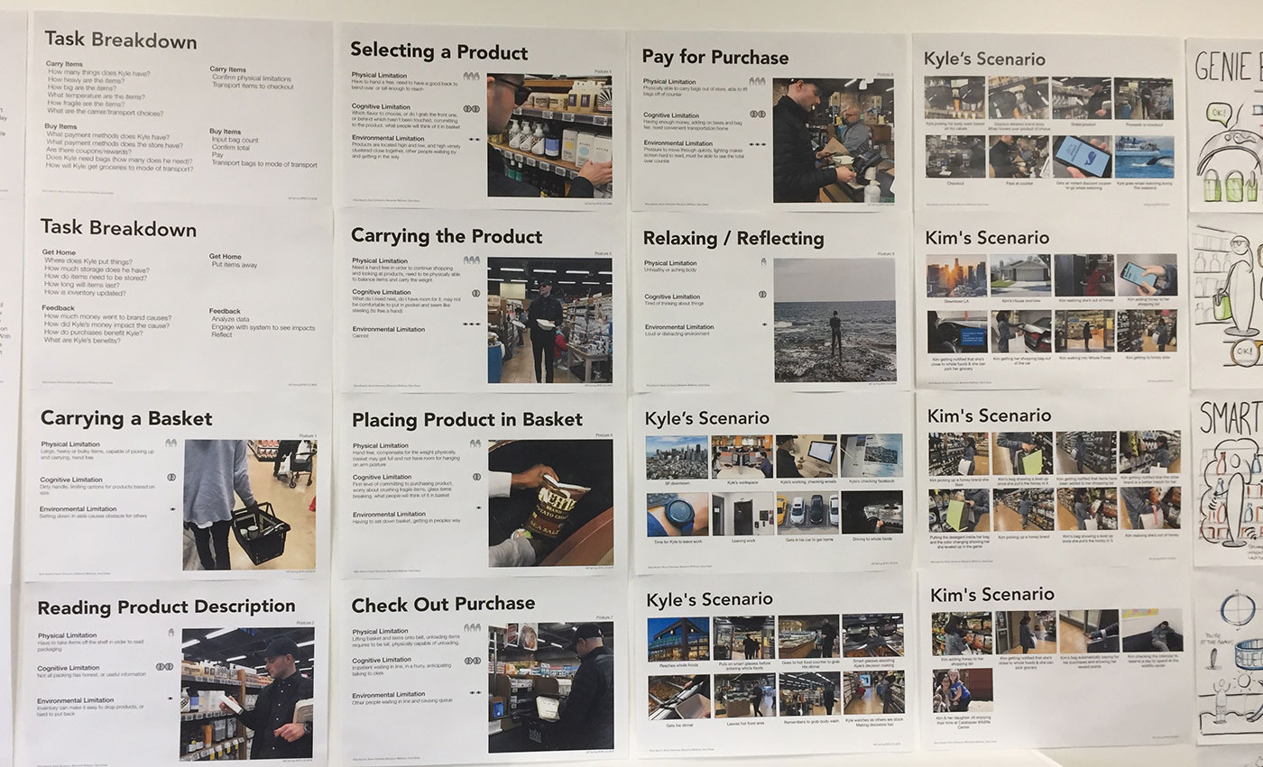
To start understanding how the app will be utilized through Kyle's ( our ripple user ) day, we started thinking about all of Kyle's tasks in a day. What does he do at the point of purchase or while making a grocery list at home?


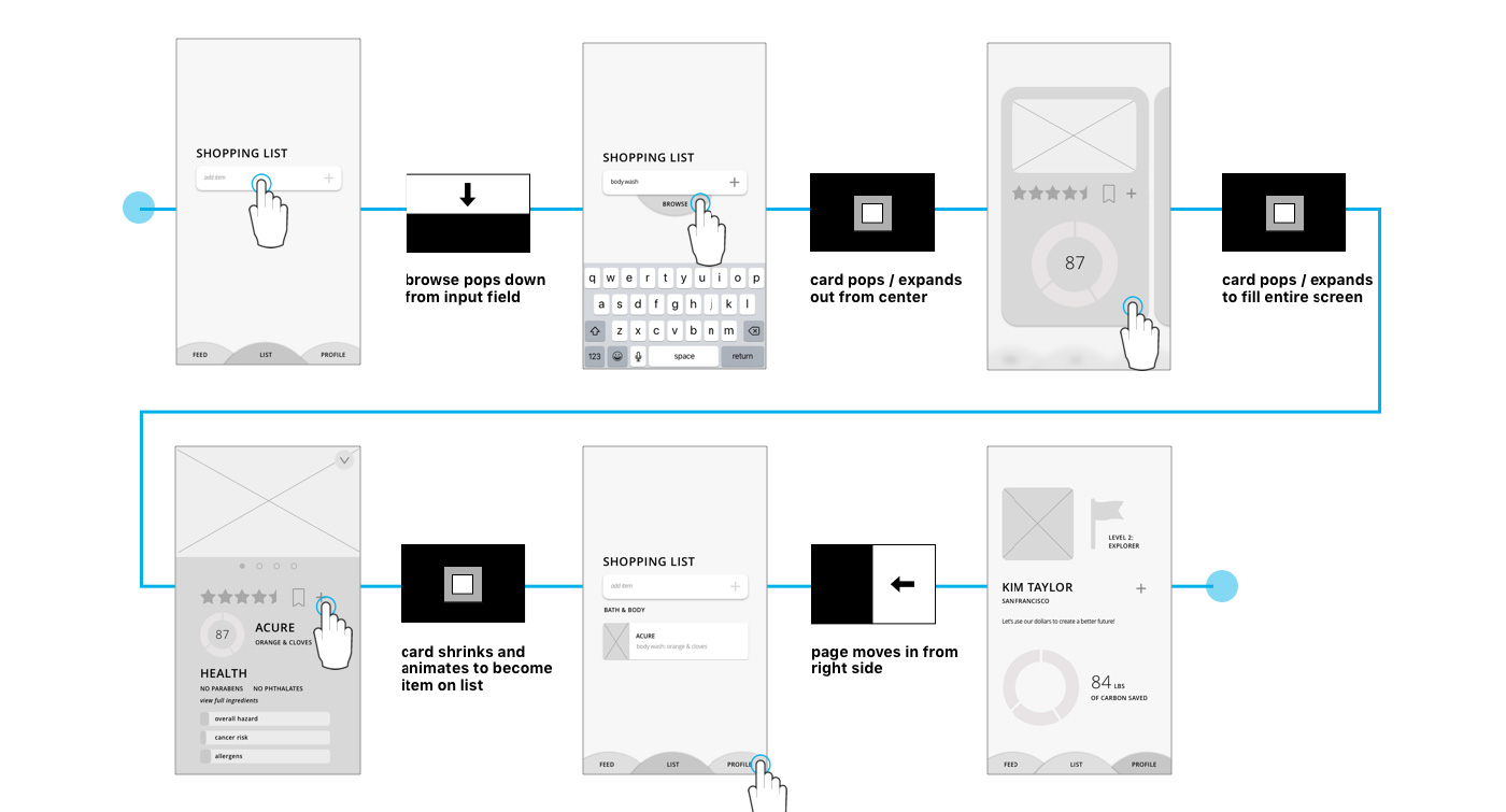
Product wireframes

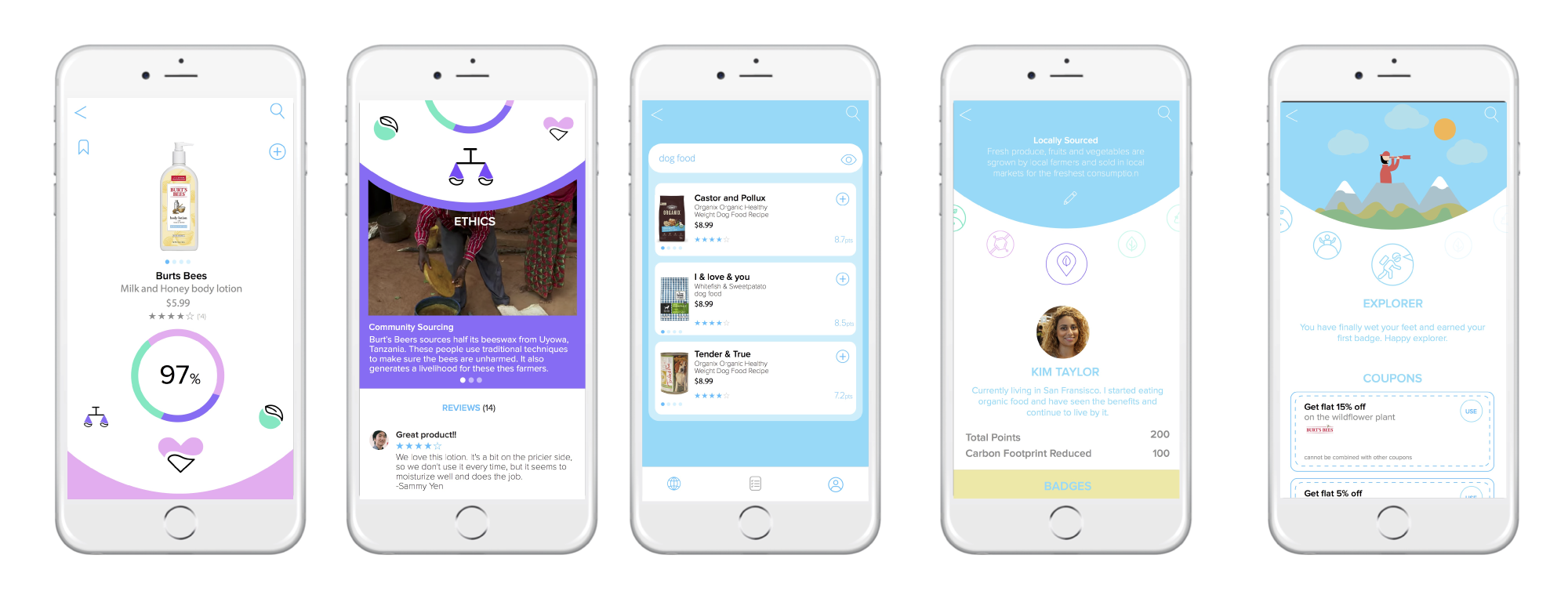
App Narrative
In designing the app we wanted to make it as simple as possible for users to set up their values, browse products, create shopping lists, understand their personal impacts, and be rewarded for their efforts. Beyond simple, we wanted to make each of these processes fun. We created playful interactions, a bright color palette and organic shape language to downplay the heaviness ingrained in environmentalism, instead moving toward optimism. We conducted user interviews which led to our strategy for organizing the information in the app. For instance, we learned that most shoppers' values were able to be categorized into either personal health, the environment, or ethics, so we allowed these to inform our three primary categories.

Shoppers spend the most time reading products to compare brand values, price, flavor, and nutrition. Even though our mobile app makes it easy to view that information at glance we still wanted to optimize our user's journey and make it "quick"

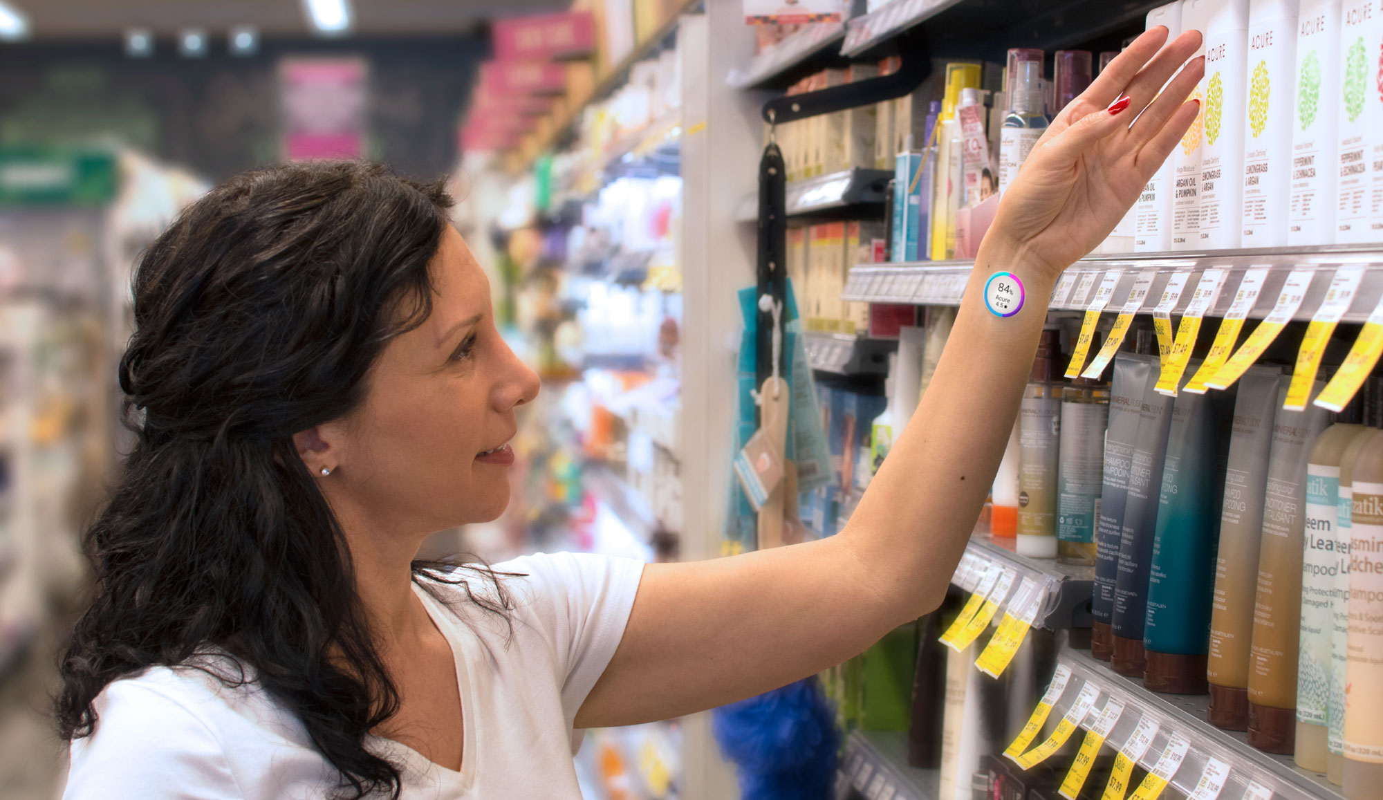


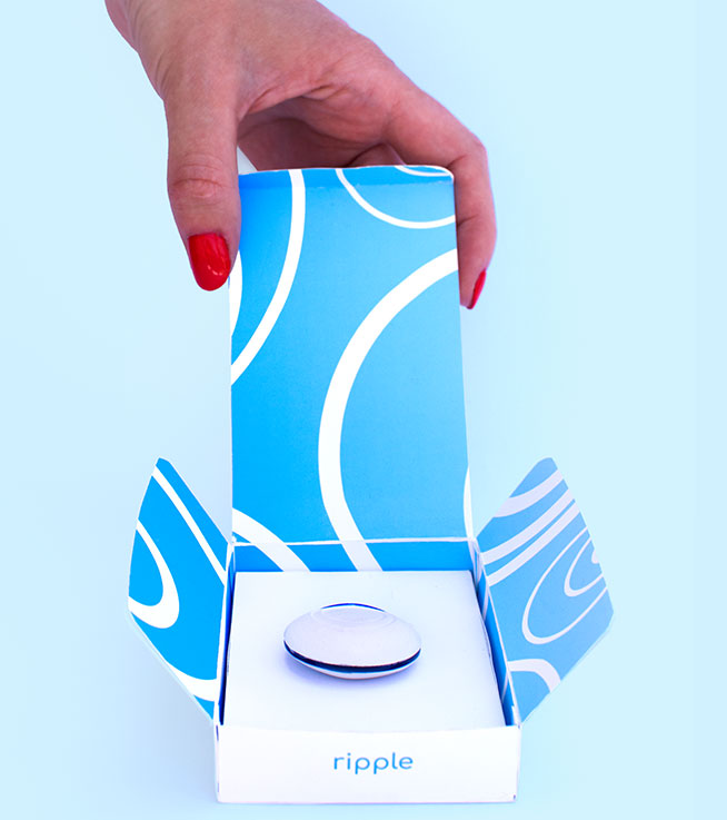

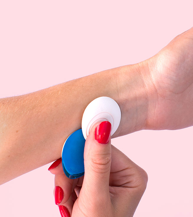


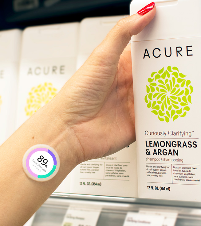
We wanted the digital screen sticker to be right at the point of purchase, which is the user's wrist. So when they reach out to grab a product they can see the average score based on the three categories we developed ie. "health", "eco", and "ethics". This helps the user select the product of their choice quickly without wasting time. Users can also see where their money is actually going and the brands they are supporting when they make a purchase. Ripple is an unbiased platform that helps users make quick and fast decisions while shopping.


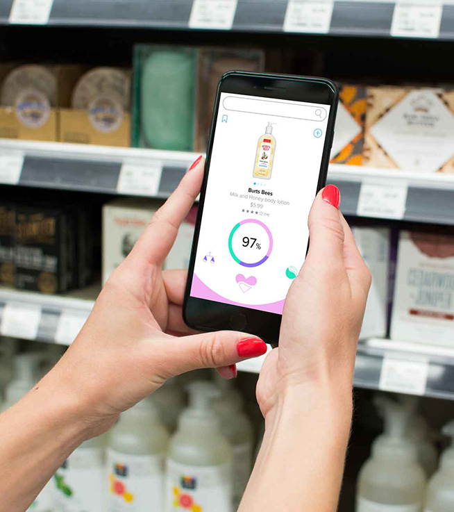
Final Ripple Ecosystem

